UCSF Delirium Initiative
Group 4 Final Project for INFO190
Delirium Metrics
This graph shows the average delirium duration (the number of days a patient spent delirious) by location and the average length of stay by location for 2017.
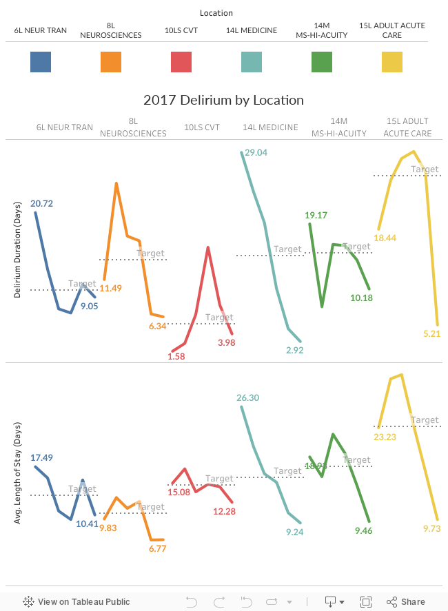
All locations except for 10LS CVT (red) showed a decrease in delirium duration. The lowest and highest average of each metric is annotated for convenience.
Patient Delirium over time
This graph displays the percent of patients who were delirious and the average percent of time the patient spent delirious by location from the start of the initiative in 2016 to the most recent data points in 2017.
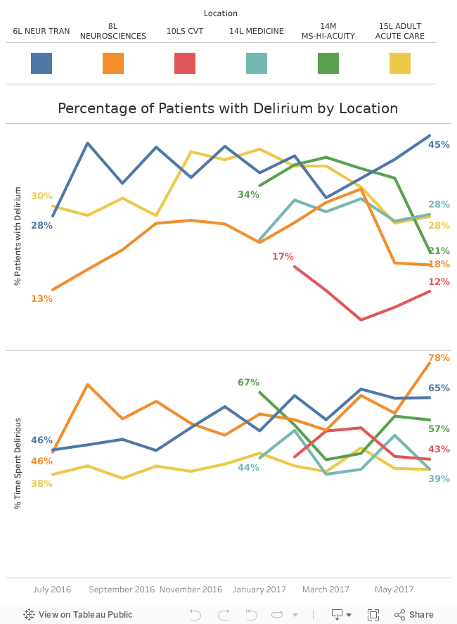
The beginning and the end percents are calculated and displayed for quicker analysis. The trends for both metrics vary among locations, with some locations doing better, some doing worse, and some staying approximately the same.